I got my hands on this dataset earlier today and I've been working on visualizing the file at the top. I had to learn about h5 file types and how to work with them in python. After a few hours, I managed to produce this:
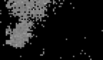
This is a visualization of the first 10k timesteps of all channels saved in the dataset. White pixels represent the highest value in the dataset, and black pixels represent the lowest. Each pixel represents one channel and is placed according to the x and y data from the dataset.
I have no clue why they are scattered like this.