Today I plotted the raw voltage values from the same dataset I've been working with for the past week. Here's the result:
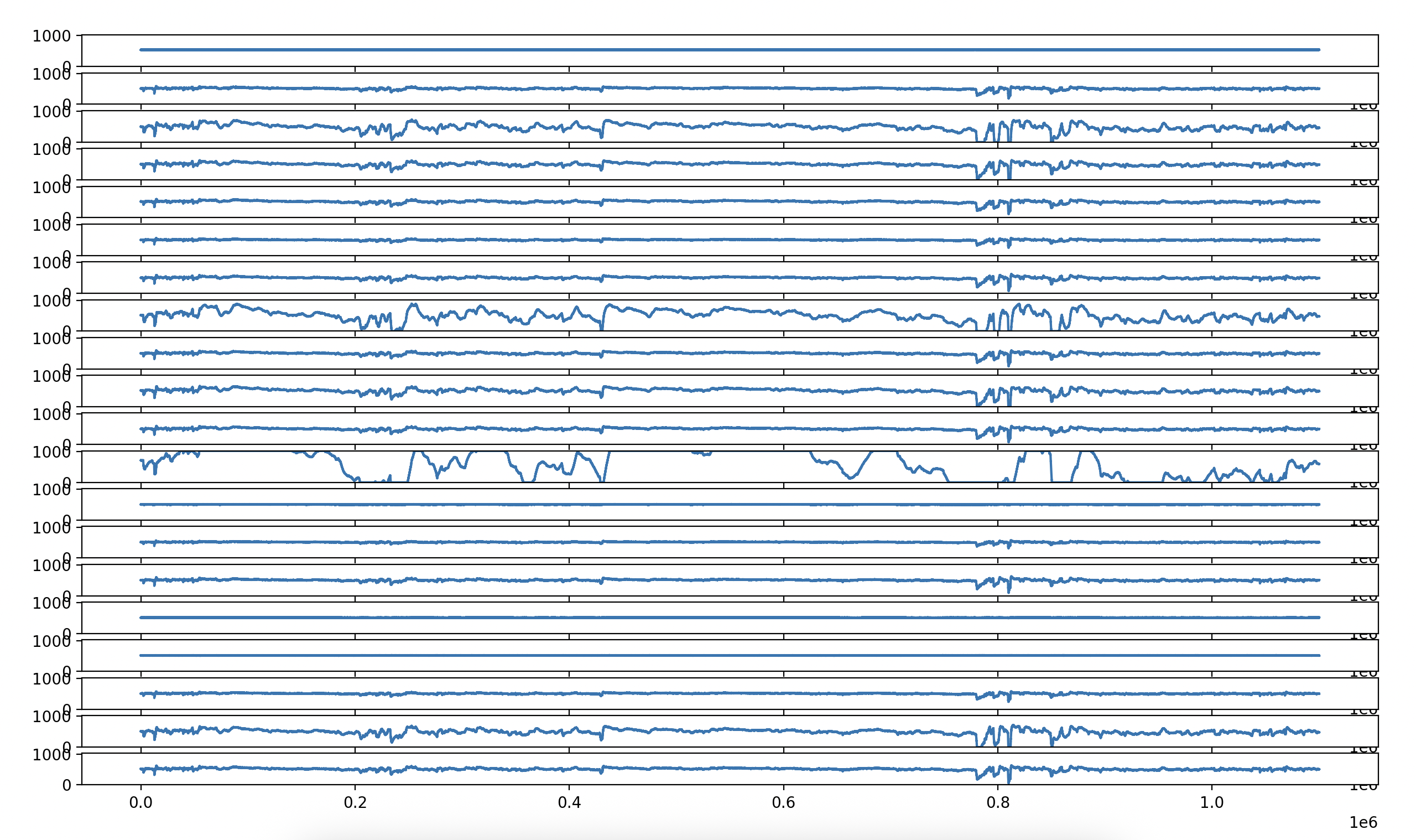
I did this just by loading the h5 file and getting the sig array:
f = h5py.File(f'mea/{filename}', 'r')
sig = f['sig']
From there, I would trim down the sig data with the number of channels I want to plot, and the number of datapoints as well. The graph above is 1.1 million datapoints across 20 channels.
data = sig[:num_of_channels, :1100000]
Then, I get the min and max values from the data using numpy:
data_max = np.max(data)
data_min = np.min(data)
And then I plot the data using matplotlib.
fig, ax = plt.subplots(num_of_channels)

for i, channel in enumerate(data):
    ax[i].plot(range(len(data[i])), data[i])
    ax[i].set_ylim([data_min, data_max])

plt.show()
This is actually the same data I used to generate the following image:

The next step is to clean up the data and perform spike sorting so that I can see when the neurons are actually spiking. The end goal is create a raster plot like the one displayed in the paper associated with this dataset.
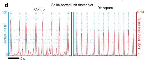
Each row represents a neuron (not a channel) and each blue dot represents a neuron spiking. To achieve this I need to use a spike sorting algorithm, and I haven't figured those out yet.
Additionally, I'm sure there's some pre-processing I also need to do. When I look at the current voltage graph, it reminds me of the first image I produced while graphing-eeg-data. It's a little messy and all over the place.