Continuing from my experiments two days ago first-try-visualizing-mea-data, I was honestly a little underwhelmed by the result of the visualization. I randomly thought "maybe I can show the difference from one frame to the next?" I had seen a few videos like this on Youtube, but I can not for find any examples of them for some reason.
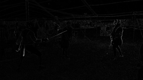
As an example, here's a gif I generated of myself fencing with this filter active. White pixels represent change since the last frame (or movement) black pixels show no change (stability).
Using the same concept on the visualization I generated two days ago (in the above mentioned post):
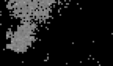
I was able to generate this (red frames at the beginning show when it loops):

I'm still just fumbling about seeing what works, so there's a high likelihood that majority of the activity shown here is just noise in the recordings. What I find promising are the bursts of white pixels that occur from time to time.